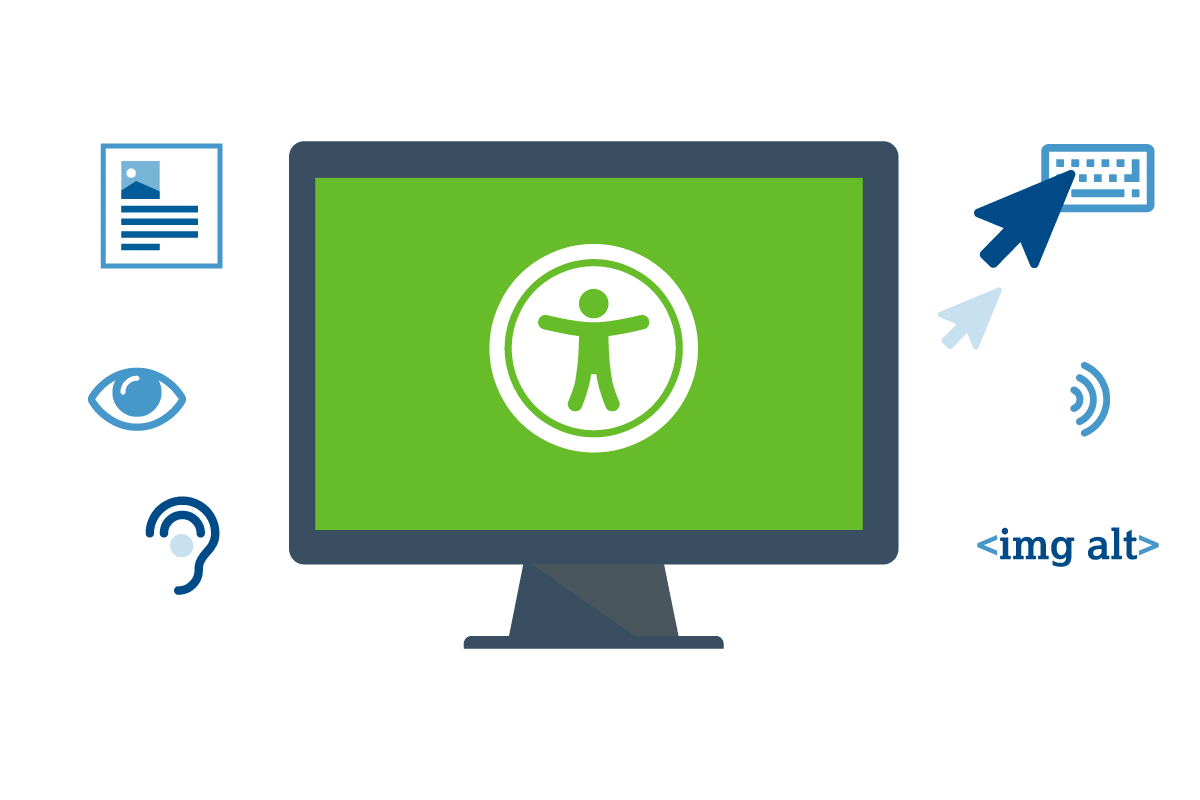
What is Website Accessibility and Why is it Important?
Updated

Can your website be used by anyone, including those with visual, hearing, or other impairments?
According to the Centers for Disease Control and Prevention, as of 2022, 15.5% of Americans have hearing issues and 18.4% have trouble with their vision, up from 13.8% and 16.6% in 2020. That means more than 60 million people in the United States might not be able to use your website unless you make sure it adheres to accessibility guidelines.
Making your website accessible isn’t just a good idea, it can also have legal implications. Since 2010, websites have been officially recognized as “places of public accommodation” subject to the requirements of the Americans with Disabilities Act, which means they have to meet certain standards of accessibility for people with disabilities.
Thousands of digital accessibility lawsuits have been filed against companies that have not made their websites accessible to people with disabilities—2,387 website accessibility cases were filed in 2022 alone. The targets of these lawsuits have ranged from small businesses to massive companies including Netflix, Nike, Target, Amazon, Peapod, and H&R Block. Small or midsize businesses usually settle in the $5,000-$20,000 range, but awards can be much higher—Target, for example, had to pay damages of $6 million.
Legal considerations aside, it’s just good ethical and business practice to make your website accessible to everyone.
Here are a few recommendations to start making your website more accessible:
- Check the guidelines. To make sure your site is accessible, review the Revised 508 Standards and 255 Guidelines and the W3C Web Content Accessibility Guidelines (WCAG), which provide specific guidelines on website accessibility that are accepted and used by individuals and organizations all over the world.
- Use an automated accessibility checker like Google's Lighthouse Chrome extension or Deque's Axe. They won't identify every accessibility issue but they can help you get started by flagging basic accessibility issues that need to be addressed.
- Make content simple and understandable. Information should be presented in the clearest and simplest manner appropriate. Break large chunks of information into manageable sections, supplement text with graphic or auditory representations when possible, and keep in mind that text may be output to speech synthesizers and braille displays and may be presented in a variety of sizes.
- Enable keyboard-based navigation. Site visitors with mobility issues may not have the dexterity or flexibility to use a mouse or touchpad, and will instead use the tab or arrow key or an alternative input device to navigate your site. Make sure all website pages can be navigated using a keyboard alone, and match the tab order of page elements to the visual order so visitors can move through the elements of the site logically.
- Use headings correctly. Screen readers use headings to navigate content, so make sure you use header tags like h1 and h2 correctly to describe the content on the page. Only use one h1 tag for the primary title of the page, then use subsequent headings (h2, h3, h4, etc.) to show the proper hierarchy of the content.
- Add alt text to images. Image alt text are snippets of text that screen readers use to describe images to visually impaired users of your website. Make sure your alt attributes clearly and accurately describe both the content and the context of the image.
- Provide synchronized text for multimedia elements. If you use video or audio on your site, use captioning or transcripts to enable site visitors to understand the content even if they can’t see or hear it.
- Use descriptive names for links. Screen readers use anchor text—the highlighted or underlined text that you click to follow a link—to describe links to vision-impaired users, so anchor text should clearly identify the target of the link with language that makes sense when read out of context, rather than something generic like “click here.”
- Make contact forms accessible. A screen reader can’t guess what’s supposed to go in a form field, so make sure all fields have descriptive labels so visually impaired users know what information is required.
- Be aware of color blindness. Approximately 9% of Americans have some type of color blindness. When choosing colors for website elements like background, logos, buttons, images, and links, be sure to use contrasting colors that are universally distinguishable, or use a color blindness website checker tool.
- Support text resizing. Using their browser, website users should be able to easily enlarge text up to 200% for better readability without loss of content or functionality.
- Allow users to stop animations. If your site uses animation, give users the option of disabling or pausing them. To avoid inducing seizures, do not create animations that flash more than three times per second.
- Add an accessibility statement. Once you've made all of the good-faith efforts you can to make your site accessible, post a clear accessibility policy/statement (see an example) and invite feedback if anything doesn't work for your users. This will benefit you and your users, and can help prevent litigious attorneys from targeting you.
This is not an exhaustive list of accessibility recommendations nor will making these updates qualify your site as accessible or compliant to industry or legal standards. Please consult a web development expert like Exposure to perform a thorough accessibility audit for your website.